Understanding the Candlestick Chart and How to use it?
- 18 Oct, 2022

If you’re just getting started in the world of technical analysis, the candlestick chart is a great place to start. This type of chart is easy to read. In this article, we’ll take a look at what candlestick charts are, how they’re constructed, and how you can use them to make better trading decisions. Keep reading to learn more.
What are candlestick charts?
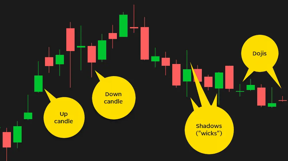
Candlesticks are one of the oldest forms of charting used in trading and data analysis. They are simple to read and understand, which is why they remain popular today. Candlesticks are made up of a series of “candles” that show security prices for a given time period. The color of the candle shows whether the close was higher or lower than the open.
So what does a candlestick chart show? A candlestick chart is a graphical representation of price action over time. It is used to illustrate the open, high, low, and close prices for a security or financial instrument over a given time period. The body of the candle indicates the opening closing prices, while the wicks indicate the high low prices. Candlestick used to identify trend reversals and trend continuations. They are also used to measure momentum and volatility. In order to use candlestick charts effectively, you need to understand what each component represents.
How do you use candlesticks?
Candlestick charts are a great data analysis tool for illustrating trading trends and prices. The colors and patterns on candlesticks can mean different things, depending on the context. In general, however, they usually follow a standard pattern. A green candle means that the closing price was higher than the opening price, while a red candle means that the closing price was lower than the opening price.
If there is a long wick (the part of the candle that is not covered by the body), it means that there was a large difference between the opening and closing prices. The longer the wick, the larger this difference was. Finally, if there is a small body and a long wick, it means that there was a lot of volatility during trading; either buyers or sellers were in control for most of the time period represented by the candle.
What are some common candlestick formations?
Candlestick formations give investors a graphical representation of the battle between buyers and sellers. The most common formations are the Doji, hammer, hanging man, engulfing pattern, and shooting star. Each formation has a specific meaning that can help an investor anticipate future price movements.
The Doji is formed when the opening and closing prices are equal, indicating that there was little buying or selling pressure over the period. This could suggest that traders are undecided about the stock’s direction and that a future move could be in either direction.
A hammer forms when the stock opens lower than it’s close but rallies to finish above its open. This indicates that buyers were able to step in and push prices higher, eventually taking control of the market. A hammer typically signifies that the bears have been beaten back, and prices could rise in the near future.
The hanging man is similar to the hammer but occurs when prices fall at first but then rally to close below the open price. This suggests that sellers were initially more successful than buyers, but bulls were eventually able to take control of prices resulting in a lower close. Like hammers, hanging men typically signal a potential reversal in prices.
An engulfing pattern is a type of candlestick chart formation that is used to predict a future bullish or bearish trend. The pattern is made up of two candlesticks, the first of which is typically a small candlestick and the second of which is a large candlestick. The large candlestick will “engulf” the small candlestick, meaning that the body of the large candlestick will completely cover the body of the small candlestick.
A candlestick chart shooting star is a type of candlestick chart pattern that is used to indicate a potential trend reversal. The shooting star is a bullish reversal pattern that is typically formed when a security experiences a sharp sell-off during the day but closes near its high. This pattern is generally regarded as a sign that the selling pressure has been exhausted and that a reversal may be in store.
The candlestick chart is a powerful data visualization tool for technical traders as it allows them to see the price action and sentiment in a security or market overall. The candlestick chart can be used to identify patterns and potential reversals in the market.


